|
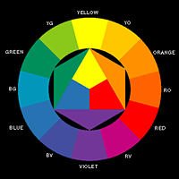
The color scheme chooser (GX) is based on classic color theory pioneered by Johannes Itten in the mid 1900s. Johannes Itten developed a new kind of color wheel that changed the way color was seen. This wheel is still in use today. This tool is based on the Johannes Itten wheel which uses yellow, red and blue as it's primary colors. (see Fig.1) Red, yellow and blue are mixed to create the secondary colors.
Green, Orange and violet are secondary colors. The six tertiary colors are made by combining the primary and secondary colors. (see Fig. 1) This type of wheel is based on pigment based inks but exists in a computer world. This allows us to 'break' some rules and interpret the wheel differently. |
|
The original color wheel is now converted into a computerized version sometimes known as the RYB (red yellow blue) color wheel. (see Fig. 2) In the computerized version we are able to include all the transition colors which are divided into 360 colors to correspond with 360 degrees of a circle. Each degree around the wheel represents a different hue (color). This is very different from the usual RGB (red green blue) color wheel used in most computer applications. (see Color Model Differences below) |
|
It is important to understand that this color model is not the
same as the RGB color wheel used in most computer applications
like Photoshop.
Differences:
|
1. RYB Hue, Saturation and Brightness. Color selection only, no input.
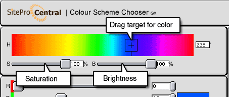
Drag the target slider to change the base hue (color). Drag the 'S' slider to change the saturation. Fully desaturated color in this model is gray. Drag the 'B' slider to change the brightness. Brightness relates to light. 0= no light and 100=lights full on. |
2. RGB Sliders. RGB and Hex color input
Drag the RGB sliders to change the base color Input RGB or Hex values from any image editing program like PhotoShop and click the buttons. NOTE. Most RGB color are outside the range of the itten color wheel so the closest color will be found. In this case the warning symbol will show. |
3. Output area
The output area will show the base colors of the scheme on the far left. The other colors are just variations of the base colors and are achieved by changing brightness and saturation values. Copy and paste the hex values you require. |
3. Scheme Selection and adjustment area
Choose different schemes (explained below) by selecting them in the drop menu. Change the distance between colors on the wheel by changing the offset value. Select paint to force the colors to emulate pigment (printed) colors. If you turn paint off some color combinations may look saturated and not combine well. This is particularly evident in the blues. |
Colors can be chosen based on their position on the color wheel in relation to each other. One side of the wheel is made up of cool colors and the other warm. Yellow, orange and blue are considered warm. Green, blue and violet are cool. Interesting combinations can be achieved by using colors from the opposite side of the wheel. the result is always a warm and cool color. This creates the effect of both colors looking more intense when side by side. Color choices must always start with and understanding of the emotions they evoke. When we say warm colors we are referring to the feelings they give us. Many adjectives can be easily converted to colors. What colors would you think of if I said 'fresh'? What color would you think of if I said 'dangerous'? Next time you begin a design,start by attaching adjectives to the idea. If you want the design to look fresh, clean and dynamic then you need to choose a blue as the base. The scheme would be analogic with the compliment to add the dynamic feeling. There are many different combinations that can be chosen and each one gives a different feeling to the viewer. Find examples of each one below. |
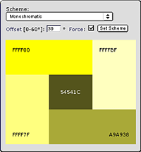
Monochromatic Color SchemeThis scheme uses the same color (hue) but changes the brightness and saturation to achieve different shades and tints. This scheme can look a little flat. Adding small areas of the compliment can help. |
||
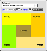
Analogic Color SchemeThis scheme uses 3 adjacent colors. The base color plus two colors 30° either side. The distance (degrees can be adjusted for different effects). |
||
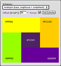
Analogic and Complimentary Color SchemeThis scheme uses the analogic colors scheme and includes the complimentary color. |
||
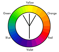
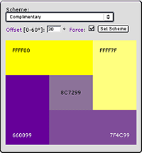
Complimentary Color SchemeThis scheme uses colors on the opposite side of the color wheel. The complimentary colors are always warm and cool together. See warm and cool at the top of the page |
||
Split Complimentary Color SchemeSimilar to complimentary but chooses the adjacent colors 30° each way of the compliment. |
||
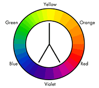
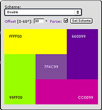
Double Complimentary Color SchemeThis uses the complimentary color scheme and includes one color 30° back from each. |
||
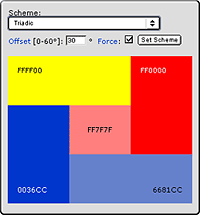
Triadic Color SchemeThis scheme uses the colors at 120° around the color wheel (360°). |